
Advanced Visual Diagnostics
Watch the system
replay itself.
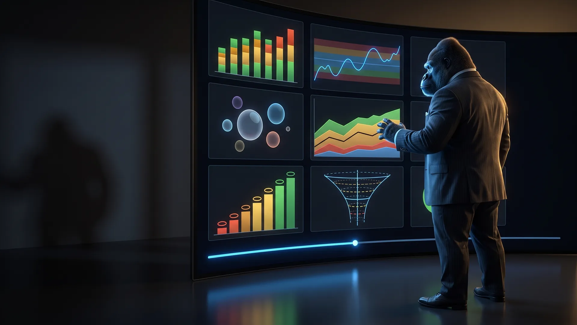
The Advanced Visual Diagnostic Edition turns the MARS workbooks into a visual analytical workstation — 450 charts you can filter, focus and scrub back through history, so you see not only what happened, but why.
What the Advanced edition holds
The same workbooks. A different instrument.
The Standard Edition reports what happened. The Advanced Visual Diagnostic Edition shows why — exposing relationships, regimes, risk interactions, execution leakage, EV structure, drawdown dynamics and decision-engine behaviour through multivariate dashboards you can filter and replay.
Charts
61 → 450
Standard → Advanced, six charted workbooks
Diagnostic structures
≈ 71%
combination, scatter, bubble, radar, envelope — up from ≈ 8%
Series per chart
6.78
nearly 3× the information in every visual
Diagnostic depth, not decoration
The Standard edition mostly answers “what happened?” The Advanced edition answers what happened, why, how the variables interact, and where the system is moving.
- ✓≈ 71% of charts are diagnostic structures — combination, scatter, bubble, radar, envelope — up from ≈ 8%
- ✓6.78 data series per chart on average, nearly 3× the Standard 2.34
- ✓Raw metrics translated into named instruments: Drawdown Terrain, Regime Ribbon, Permission Envelope
Interactive filters & historical replay
Don’t just view your performance — choose the conditions you want to investigate. The controls feed the calculations, not just chart visibility.
- ✓Population filters — branch, session, direction, execution grade, cycle within the week
- ✓Time-window replay — e.g. the last eight weeks ending at any logged week
- ✓Breakdown and metric selectors — compare by branch or session; show net EV or capture
- ✓Reference and scenario controls — Monte Carlo median vs zero; projection horizon
Focus without losing context
Highlight what you are examining while the comparison that gives it meaning stays on screen.
- ✓Throttle gate and tier focus ring and mark matching cycles — the rest of the history stays visible
- ✓Variant Attribution outlines the selected variant in gold instead of hiding its competitors
- ✓CP3 branch-lens charts sit beside all-branch comparisons by design
Charts that explain themselves
Each chart tells you how to read it. Explanatory titles grow from ≈ 36 to ≈ 140 characters on average, reducing interpretation friction.
- ✓Reference bands, target lines, confidence envelopes and risk zones encoded directly
- ✓Dashed reference lines on 348 charts (21 in Standard)
- ✓Transparency layering on 166 charts and gradient structures on 80 (none in Standard)
- ✓Axis titles on 300 charts, up from 17
Seven replays
Scroll, and watch the charts play out week by week.
Seven charts from five Advanced workbooks, replayed the way their replay controls scrub history. Scroll forward to advance the replay, back to rewind. Each title rewrites itself as the data moves — the Advanced charts state their own reading.
Every replay is simulated data drawn inside the real chart design — the same series, state colours, bands and gate floors as the workbook. It is not an account’s results and not a forecast. Your workbook draws the same charts from your own journal.
01 / 07 · Compliance Panel 3
Simulated dataEV Pulse & σ Ribbon — W1 · 4-week −0.16R ±0.00σ · 12-week −0.16R · below zero — watch the ribbon
- at / above plan
- positive
- negative
- 4-week avg ± 1σ
- 12-week avg
Compliance Panel 3 · Main Dashboard
EV Pulse & σ Ribbon
“Is my edge running at plan — and is this week noise, or a change?”
What it shows
Every week's EV as a column coloured by state, with the 4-week average riding inside a ±1σ ribbon and a dashed 12-week average underneath. A single red week inside a wide ribbon is variance; the ribbon itself sliding under the plan line is a structural change.
How it helps the operator
- ✓Separates a bad week from a bad regime at a glance
- ✓The ribbon's width is the honesty check — a tight ribbon means the average can be trusted
- ✓Two averages at different speeds show turning points before the cumulative curve does
Filters & replay
In the workbook: a branch lens (Normal, Trend Partial, Trend No-Partial, Overflow and the blends), a window of 8–52 weeks and an ending-week replay. Try the window chips on the chart — the replay keeps your window ending at the current week.
The workbook caption
Weekly EV of the selected branch lens as columns coloured by state · 4-week average inside its ±1σ ribbon · dashed 12-week average · plan lines
The workbook draws the 4-week average in gold; on this page it is white.
02 / 07 · Compliance Panel 3
Simulated dataDrawdown Terrain — W1 · 0.0% from peak · Growth gate (T7 ceiling) · 7.0 pts above the Recovery floor
- Growth
- Recovery
- Buffer
- Floor
- Deep-Floor
- Ground-Floor
- System Lock
Compliance Panel 3 · Main Dashboard
Drawdown Terrain
“How close am I to the next brake — and how fast am I getting there?”
What it shows
The seven MARS gates painted as strata — Growth, Recovery, Buffer, Floor, Deep-Floor, Ground-Floor, System Lock — with the account's end-of-week drawdown drawn through them. The current gate lights up; the title states the gate, its tier ceiling and the distance to the next floor.
How it helps the operator
- ✓Drawdown stops being a number and becomes a position on a map with consequences
- ✓You see the approach to a floor weeks before the gate changes your risk ceiling
- ✓Recovery is visible as climbing back through the strata — the brakes releasing in order
Filters & replay
Follows the Main Dashboard's as-of controls; the Gate / Brake dashboard adds a full gate staircase with its own window.
The workbook caption
End-of-week drawdown against the gate floors. Coloured strata are the gate bands (Growth at the surface, System Lock at the bottom). The line is where the account closed each week — watch how close it runs to the next floor.
03 / 07 · MAE/MFE Execution Efficiency Lab
Simulated dataEfficiency-Zone Tide — W1 · 14% elite · 28% leaky · capture 41% · win rate 63%
- Elite
- Good
- Partial
- Leaky
- avg capture
- win rate
MAE/MFE Execution Efficiency Lab · Dashboard
Efficiency-Zone Tide
“Am I keeping more of what the market gives me — week after week?”
What it shows
Each week's trades split into capture zones — Elite, Good, Partial, Leaky — as a 100% column, with average capture and win rate drawn across on a second axis. When the green rises and the amber and red recede, execution is improving, whatever the P&L says.
How it helps the operator
- ✓Shows execution quality separately from outcome — a losing week can still be a disciplined one
- ✓The tide makes slow drift visible: a leaky share creeping up is a habit forming
- ✓Capture and win rate side by side show whether you are trading more selectively or exiting worse
Filters & replay
Six section filters (session, direction, emotional tag, execution grade, ATR state, plan adherence) plus an asset selector covering single instruments and groups — All FX, USD, EUR, GBP and JPY pairs, commodities, indices.
The workbook caption
Weekly mix of trades by capture efficiency zone (100% stacked) · solid line = avg capture · dashed = win rate (right axis)
04 / 07 · MAE/MFE Execution Efficiency Lab
Simulated dataWeekly MAE × MFE Map — W1 · grade D · avg MAE 0.53R · avg MFE 0.69R · 18 trades
- grade A
- grade B
- grade C
- grade D
- this week
MAE/MFE Execution Efficiency Lab · Weekly Rollup
Weekly MAE × MFE Map
“Are my entries getting cleaner and my trades getting more room?”
What it shows
One bubble per week: how far trades went against you (MAE) against how far they went for you (MFE), sized by trade count and graded A to D. Older weeks fade, so the replay leaves a trail — the migration of your execution across the map.
How it helps the operator
- ✓Upper-left is the goal — low heat, high opportunity — so progress is a direction you can watch
- ✓Heavy-heat weeks expose entry-timing problems that win rate hides
- ✓Bubble size stops a two-trade week from looking as important as a twenty-trade week
Filters & replay
Part of a 108-chart lab. Its EV Excursion Alpha gallery adds a 15-control filter panel: branch, window, timeframe, pair, session, direction, MAE / MFE / capture zone, execution grade, plan adherence, emotional tag, ATR state, outcome and swap-held.
The workbook caption
Each bubble = one week · x = avg MAE · y = avg MFE · size = trades · colour = week quality grade (A best → D)
05 / 07 · Throttle Control Panel
Simulated dataGate Ceiling Tape — W1 · signals asked T4 · Growth caps T7 · deployed T4 — fully authorised
- Growth
- Recovery
- Buffer
- Floor
- deployed tier
- signals asked
Throttle Control Panel · Throttle Visual Diagnostics
Gate Ceiling Tape vs Deployed Tier
“Why did the system deploy the tier it did — and what held it back?”
What it shows
Every cycle as a column whose height is the tier the current gate allows, coloured by that gate. The dashed line is what the signals alone asked for; the solid line is what was actually deployed. The gap between them is the rail doing its job.
How it helps the operator
- ✓Moves you from “the system selected Tier 4” to which constraint made it Tier 4
- ✓Shows over-ruled conviction: signals asking for T6 under a T4 ceiling, cycle after cycle
- ✓Gate focus rings a gate's cycles without deleting the rest of the deployment history
Filters & replay
A seven-control console: window (4–64 weeks or all), replay week, replay mode, gate focus, tier focus, cycle-in-week and an SDE overlay. Try the window and gate-focus chips on the chart.
The workbook caption
Column = gate cap tier for every cycle, coloured by gate · solid line = final tier · dashed = what the signals alone asked for
The workbook draws the signal-ask line in violet; on this page violet is reserved for Monte Carlo, so it is dashed electric blue.
06 / 07 · Advanced EV Analytics Lab
Simulated dataEV convergence funnel — running EV after 5 trades: −0.01R · 95% band −1.24 to +1.21 · the band still straddles zero — not proven yet
- running EV
- upper bound
- lower bound
- Monte Carlo median
Advanced EV Analytics Lab · Advanced EV Engine
EV convergence funnel
“Have I proven an edge yet — or am I still inside the noise?”
What it shows
Running expectancy trade by trade, wrapped in a 95% confidence band that narrows as evidence accumulates, with the Monte Carlo median as the reference. In the workbook the title is a live formula: it writes the current reading, so the chart tells you what it means.
How it helps the operator
- ✓Early EV is mostly noise — the funnel shows exactly how much
- ✓The moment the lower bound clears zero is the moment the edge is statistically real
- ✓Reading against the Monte Carlo median shows whether you are tracking the plan's distribution
Filters & replay
Inherits the lab's central scope (branch, date scope, pair, session, direction, timeframe, ATR state, coefficient, gross / net). A local filter narrows it — an empty intersection is a scope conflict, not missing history.
The workbook caption
Running EV after N trades, inside its confidence band, against the Monte Carlo median
07 / 07 · Variant Attribution
Simulated dataRolling EV vs Edge-Regime Bands — W1 · Variant A +0.59R (positive edge) · Standard +0.79R · Variant B +0.25R
- positive edge
- neutral
- negative edge
- selected (outlined)
Variant Attribution · Variant Dashboard
Rolling EV vs Edge-Regime Bands
“Which management variant is actually carrying the edge right now?”
What it shows
Each variant's rolling EV drawn through five edge-regime bands, from negative edge to positive edge. The selected variant is outlined while its competitors stay on the chart, so attribution is always a comparison — never a variant judged alone.
How it helps the operator
- ✓Shows a variant crossing from positive edge into neutral before the totals do
- ✓Keeps the comparison honest: the selected variant is emphasised, not isolated
- ✓Regime bands turn a wiggly line into a state you can act on
Filters & replay
Window (4–64 weeks or all), branch and variant controls on the Variant Dashboard; Dynamic Geometry has its own. Pick a variant on the chart — the others stay visible.
The workbook caption
Rolling EV of the last N lens trades against the Config EV bands
The workbook outlines the selected variant in gold; on this page the outline is electric blue.
Interactive diagnostic filters & historical replay
Don't just view your performance. Choose what to investigate.
The controls feed the calculations, not just chart visibility. They come in five kinds — and they are not all filters. Knowing which is which is how you read the answer correctly.
Population filters
Which trades or cycles qualify for the analysis
e.g. Branch, session, direction, execution grade, cycle within the week
Time-window & replay
Which historical interval is displayed
e.g. The last eight weeks ending at any selected replay week
Focus & highlight
Which observations are emphasised while comparison data stays visible
e.g. Rings around a selected gate; an outlined variant beside its competitors
Breakdown & metric selectors
How the selected data is grouped and what is measured
e.g. Compare by branch or by session; show net EV or capture efficiency
Reference & scenario
The benchmark or assumption the visual is read against
e.g. Monte Carlo median vs zero; tail depth; projection horizon
The controls, workbook by workbook
Compliance Panel 3
9 → 166 chartsBranch lens, 8–52-week windows and an ending-week replay on the EV section; as-of and window controls on the Capital, Daily and Regime dashboards.
One dashboard becomes an eight-environment analytics command center.
MAE/MFE Execution Efficiency Lab
3 → 108 chartsA 15-control filter panel around the 40-chart Excursion Alpha lab, plus an asset-group selector and an 8-way breakdown × 13-metric Weekly Lab.
36× the charts — from “here is your efficiency” to where it is created, lost and recovered.
Advanced EV Analytics Lab
16 → 80 chartsChart-local filters layered on the central scope; a 12-chart Conditional Context lab with switchable comparison splits; reference, tail-depth and horizon controls.
The Standard lab summarizes EV. The Advanced lab interrogates it from every direction.
Throttle Control Panel
11 → 44 chartsA seven-control console: 4–64-week windows, historical replay week and mode, cycle-in-week, SDE overlay, and context-preserving gate and tier focus.
Not just “Tier 4 was selected” — exactly which gates, modifiers and signals put it there.
Variant Attribution + Dynamic Geometry
17 → 47 chartsWindow, branch and variant controls — the selected variant is outlined in gold while its competitors stay visible.
Dynamic Geometry gets a full visual layer — DG Dashboard 1 → 10 charts, DG Performance 5 → 10.
Scope, stated plainly
- There is no single filter across every chart — controls are workbook-, dashboard-, section- or chart-scoped.
- A local filter narrows the central scope. An empty chart can be a scope conflict, not missing history.
- Replay covers logged diagnostics. The Throttle’s current-state panels are not reconstructed for past weeks.
- Some comparison and full-history panels deliberately keep a broader sample — so a branch is always read against its alternatives.
Where the 450 live
Twenty-nine chart environments.
Counted chart by chart from the Advanced workbooks. Compliance Panel 3 alone grows from one nine-chart dashboard into eight dashboard environments.
Compliance Panel 3
166 charts
- Main Dashboard23
- Weekly Summary15
- Gate / Brake15
- Compounding25
- Capital17
- SDE26
- Regime30
- Daily15
MAE/MFE Execution Efficiency Lab
108 charts
- Dashboard29
- Weekly Rollup12
- Sensitivity Engine13
- Distribution Maps14
- EV Excursion Alpha40
Advanced EV Analytics Lab
80 charts
- Dashboard12
- Conditional Context12
- Scenario / What-If11
- Advanced EV Engine9
- Growth EV9
- Mechanical Leakage7
- EV Analytics Lab6
- Pip EV Lab6
- Rolling EV Engine4
- Behavioral EV4
Throttle Control Panel
44 charts
- Throttle Visual Diagnostics32
- Cycle Dashboard12
Variant Attribution + Dynamic Geometry
47 charts
- Variant Dashboard27
- DG Dashboard10
- DG Performance10
Weekly Trading Scorecard
5 charts in both editions. It ships in the Advanced edition as the executive scorecard with reporting extended to 18 periods — not counted as a chart upgrade. The Monte Carlo Lab is identical in both editions.
| Measured | Standard | Advanced |
|---|---|---|
| Total charts | 61 | 450 |
| Chart-bearing worksheets | 17 | 29 |
| Multivariate combination charts | 2 | 188 |
| Scatter / relationship diagnostics | 1 | 80 |
| Bubble-map diagnostics | 0 | 15 |
| Multidimensional radar diagnostics | 1 | 26 |
| Secondary / multi-axis charts | 2 | 132 |
| Charts with explicit axis titles | 17 | 300 |
| Average data series per chart | 2.34 | 6.78 |
| Diagnostic-class share of charts | ≈ 8% | ≈ 71% |
Edition upgrade · $200 on Core or Pro
See the system. Diagnose the system.
Choose the Advanced Visual Diagnostic Edition at checkout — the same one-time payment, with the diagnostic chart layer, its filters and historical replay included.
Compare the editions on the pricing pageThe Advanced Visual Diagnostic Edition is the same workbooks, the same calculations and the same governed logic as the Standard Edition — it adds the diagnostic chart layer and its controls. The Weekly Trading Scorecard (5 charts) and the Monte Carlo Lab are identical in both editions. Controls vary by module and are scoped to their workbook, dashboard or section; there is no single filter across every chart. Historical replay covers logged diagnostics; current-state panels such as the Throttle’s open-exposure view are not reconstructed for past weeks. Filters change what you examine — they never change the evidence itself.
Put your trading on rails.
Eleven governed modules. One authority system. Everything included — $497, one time.